Photo by Daniel Cañibano on Unsplash
How to Adapt UX for New Interfaces: Multi-Device Experiences
Topics in this article:
- Prioritize content to adapt UX for smaller interfaces
- Adapt UX for new interface interactions
- Go beyond responsive to fully adapt UX for new interfaces
- Test across real devices to adapt UX with confidence
- Prioritize accessibility when you adapt UX for new interfaces
- To adapt UX for new interfaces, focus on intent
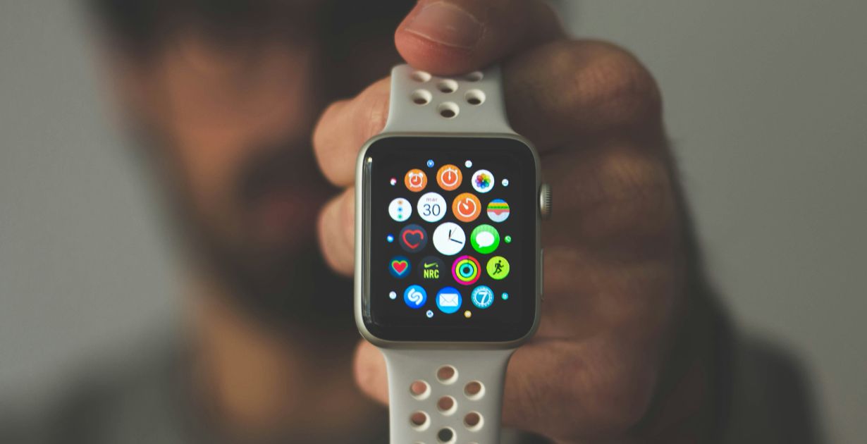
Adapting UX for new interfaces starts with understanding the user’s environment and expectations. Different devices come with different usage patterns, behaviors, and levels of attention. A smartwatch isn’t just a smaller phone—it’s a whole different context.
- Wearables are for quick, glanceable interactions: notifications, health data, and one-tap responses.
- Mobile devices support moderate interaction—users expect to get in, get it done, and move on.
- Tablets often serve as hybrid tools: larger than phones, more immersive, but often still touch-driven.
- Desktops remain the home of deep focus: longer sessions, detailed inputs, and more complex navigation.
Designing with device context in mind ensures the right features show up in the right places, with the right level of detail.
Prioritize content to adapt UX for smaller interfaces
The smaller the screen, the less room for clutter—or indecision. Designing for wearables and phones demands extreme prioritization.
- Lead with the core action the user needs to take. If it’s not essential, it doesn’t belong.
- Collapse or defer secondary actions. Use drawers, toggles, or progressive disclosure.
- Use visual shorthand when appropriate. Replace text-heavy components with icons, badges, or single numbers.
Smaller screens reward simplicity. Strip the experience down to its functional essentials.
Adapt UX for new interface interactions
Not all screens are clicked. From taps and swipes to haptic feedback and voice commands, input methods vary—and your UX should adapt accordingly.
- Ensure all tap targets are large enough (44×44 pixels minimum for touch interfaces).
- Use gestures for efficiency: swiping to dismiss, tap-and-hold for secondary actions, pinch to zoom.
- Support voice input on mobile and wearables where typing is impractical.
- On desktop, preserve keyboard accessibility and fine-grained control via cursor or keyboard.
Design for the way users interact—not just for the size of the screen.
Go beyond responsive to fully adapt UX for new interfaces
Responsive design resizes. Adaptive design rethinks.
- A responsive layout ensures your content scales fluidly, but that’s just the beginning.
- Adaptive experiences change what content appears, how it’s grouped, and how features behave.
For example:
- A mobile app might show a single CTA on the homepage, while the desktop version offers secondary options.
- Wearables might only show status indicators or brief alerts.
Design not just for size—but for relevance.
Test across real devices to adapt UX with confidence
Emulators are helpful, but they can’t replicate the quirks, gestures, lighting conditions, or context of real devices.
- Test with real users on real devices, across screen sizes and operating systems.
- Use services like BrowserStack, Sauce Labs, or native device labs to expand test coverage.
- Watch for micro-interactions that break under different screen resolutions or input methods.
Iterate based on real-world feedback, not just pixel-perfect previews.
Prioritize accessibility when you adapt UX for new interfaces
Accessibility isn’t a layer—it’s a foundation. And it looks different on every device.
- For mobile: ensure good color contrast, readable text sizes, voice control support, and clear touch targets.
- For tablets and desktops: support screen readers, keyboard navigation, and ARIA labels.
- For wearables: prioritize haptic feedback, minimal screens, and simple gestures.
Make sure every user—regardless of device, ability, or context—can use your product confidently.
To adapt UX for new interfaces, focus on intent
Designing UX for new interfaces isn’t about duplicating layouts across devices—it’s about creating an experience that adapts without losing coherence.
That means understanding user intent, simplifying aggressively, adapting to inputs, and testing for reality—not just for responsiveness.
The more your product feels native to the device it lives on, the more usable, trusted, and satisfying it becomes. The future is multi-device—and your UX should be, too.


Get a love note
Get the latest UX insights, research, and industry news delivered to your inbox.


advertisement